Test 2
Digital EnablementAnalytics & InsightsCustomer Experience
Read More About Test 2

What we learned from preparing and modeling COVID-19 data

The COVID-19 pandemic affects all of us. It leaves us searching for answers and struggling to understand what comes next: are things getting better? Worse? Or have they settled into an uneasy stasis?
These are difficult questions. Data gives us a useful tool for answering them and understanding the course of the pandemic. However, finding complete data on the COVID-19 outbreak is difficult.
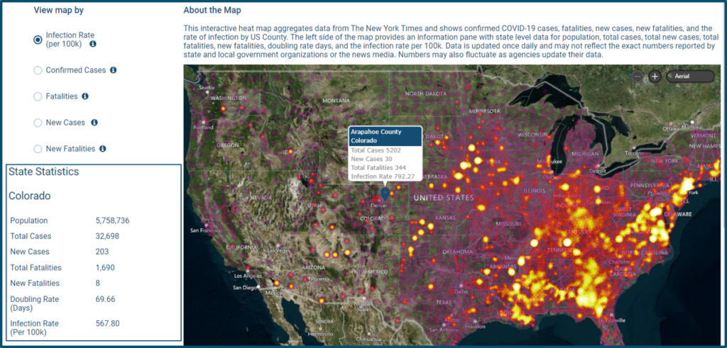
To counter this, RevGen has compiled reliable data sources and used data processing technology to clean, curate, and share easily consumable data with the public. We’ve also created a visualization to show COVID-19 data by the dimensions outlined below and the parameters of infection rate, fatalities, and cases.
Data on COVID-19 is incomplete from any currently available source. Experts say many cases have gone unreported, which means a truly complete dataset doesn’t currently exist. Data collection is also not uniform across the thousands of institutions reporting cases. This causes variation between data sources. And the method for calculating metrics can change. In some cases, it’s also not clear if COVID-19 or some other ailment proved fatal. The details are lost when data is aggregated.
The available data is directionally representative, which can provide a sound foundation for understanding the pandemic. RevGen identified several reputable sources of COVID-19 information available to the general public and integrated those sources to build an enriched data model using the Azure Platform. The sources include:
While each individual data source has its advantages and limitations, they paint a more complete picture when combined.
Not all data plays well together. (We see this often among organizations that grew through acquisitions and inherited dozens of data collection processes.) The most time-consuming step in creating a usable collection of data analytics lies in data collection and cleansing. There are no shortcuts. Reconciling datasets requires an understanding of each measure, how it was collected, and how it was reported.
There are issues with the timing of the available COVID-19 data – when it was collected and how it was aggregated before it got to us. There are also missing data and periodic corrections to the data, which must be applied retroactively.
As is typical, the data for COVID had issues with naming conventions. For example, in our preparation activities we found Adams county identifier (FIPS code) should have been 08001. The source data had it as an integer: 8001. We had to check lengths of the county FIPS and prepend a 0 where the length was four.
Modeling is a useful tool in identifying gaps. For example, an initial heatmap of cases in New York State indicated zero cases around the city. We know that is not true.
A closer look at the data revealed that instead of breaking cases in New York City up by the constituent counties (New York, Kings, Bronx, Richmond, and Queens), data was listed under “New York City.” A quick data fix shows the heavy concentration of cases in the city and the comparatively low number of cases upstate.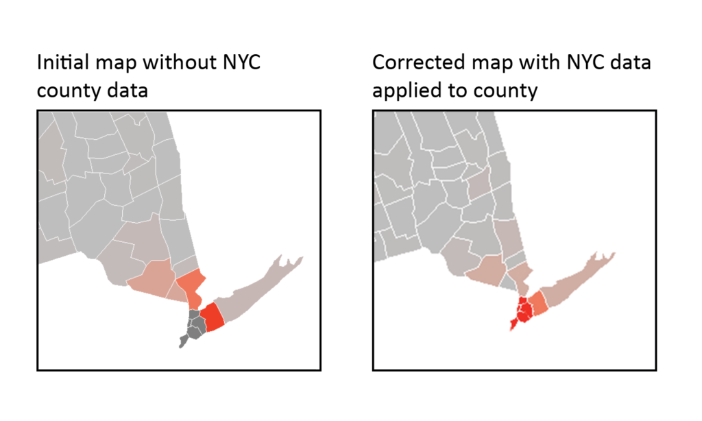
Once we understood sufficiently what went into the data collection from each source and how to combine the data appropriately, we derived some basic metrics. Those metrics include:
The cleaned datasets aim to present information clearly and logically. This allows for easy data modeling. Modeling helps us to draw insights on the three things we care about:
Models do this by showing how two or more sets of data are related: how time affects the number of cases, how the number of cases affect the number of deaths, and how location affects the growth of cases (hotspots).
By aggregating, cleansing, and preparing data we are hoping to make these kinds of comparisons easier.
On May 5th:
This highlights the uneven spread of the virus across the US and points to the efficacy of social distancing as new cases continue to diminish in regions that acted early. The data provide a basis for understanding forces behind the spread of the virus.
Combined with other data sources, these numbers could help fuel causal analysis: Is population density the driver? Is it timing? Local policy? Or is it luck?
Though the data is an important piece of our understanding, it must always be used in context. Contained in the COVID-19 data are continued evidence of a declining rise in new cases and the shocking toll the virus continues to take on the country.
It is nearly impossible to understand the implications of major events while living through them. History is rife with examples. Data is a valuable ally in this quest for understanding. It helps us make the best decisions possible even while incomplete. It won’t answer all our questions, but it is does provide hope for answering any of them.

For a 4th year, RevGen Partners has been named an honoree of the Civic 50 Colorado
Read More About RevGen Proud to be Named Civic 50 Colorado HonoreeGet the latest updates and Insights from RevGen delivered straight to your inbox.